CONTEXT
Concerts are all about the experience. From the moment you’re in queue for tickets to hearing your favourite artist’s voice, it’s important that fans get the information they need, when they need it.
On social media, Ticketmaster has been criticized many times for its policies and lack of clarity to their customers. Essential details like additional fees, venue restrictions, and ticket-transfer policies are not always clearly communicated.
The lack of transparency leads to a poor and frustrating experience that negatively impacts the ticket-buying process for both fans and artists.
PROBLEM STATEMENT
How can I create a design system for a product that builds trust and excitement with its users?
The Solution
Introducing Concerto, a ticketing company that strives to simplify the ticket-buying process and provide a transparent experience to its customers.

BRANDING
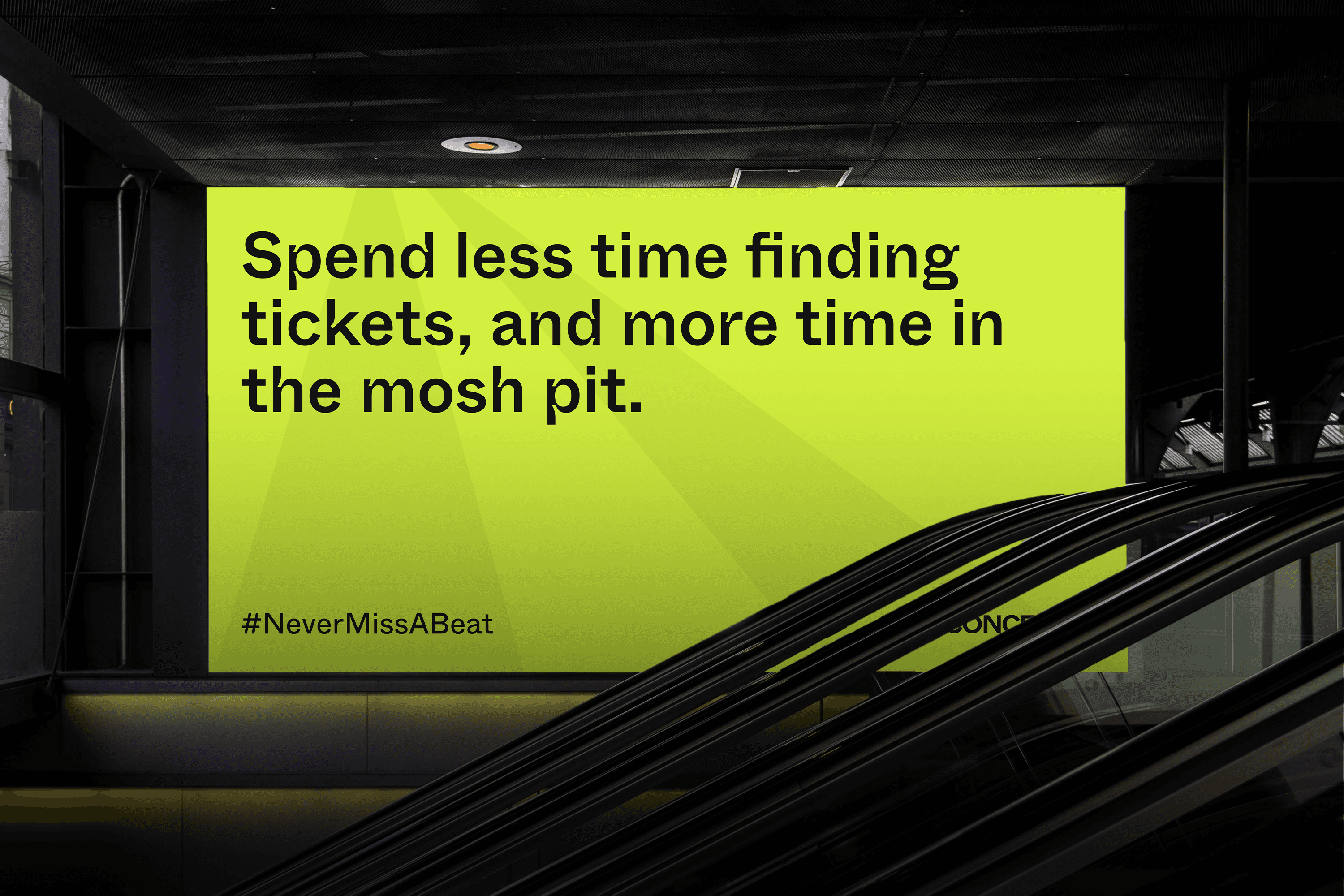
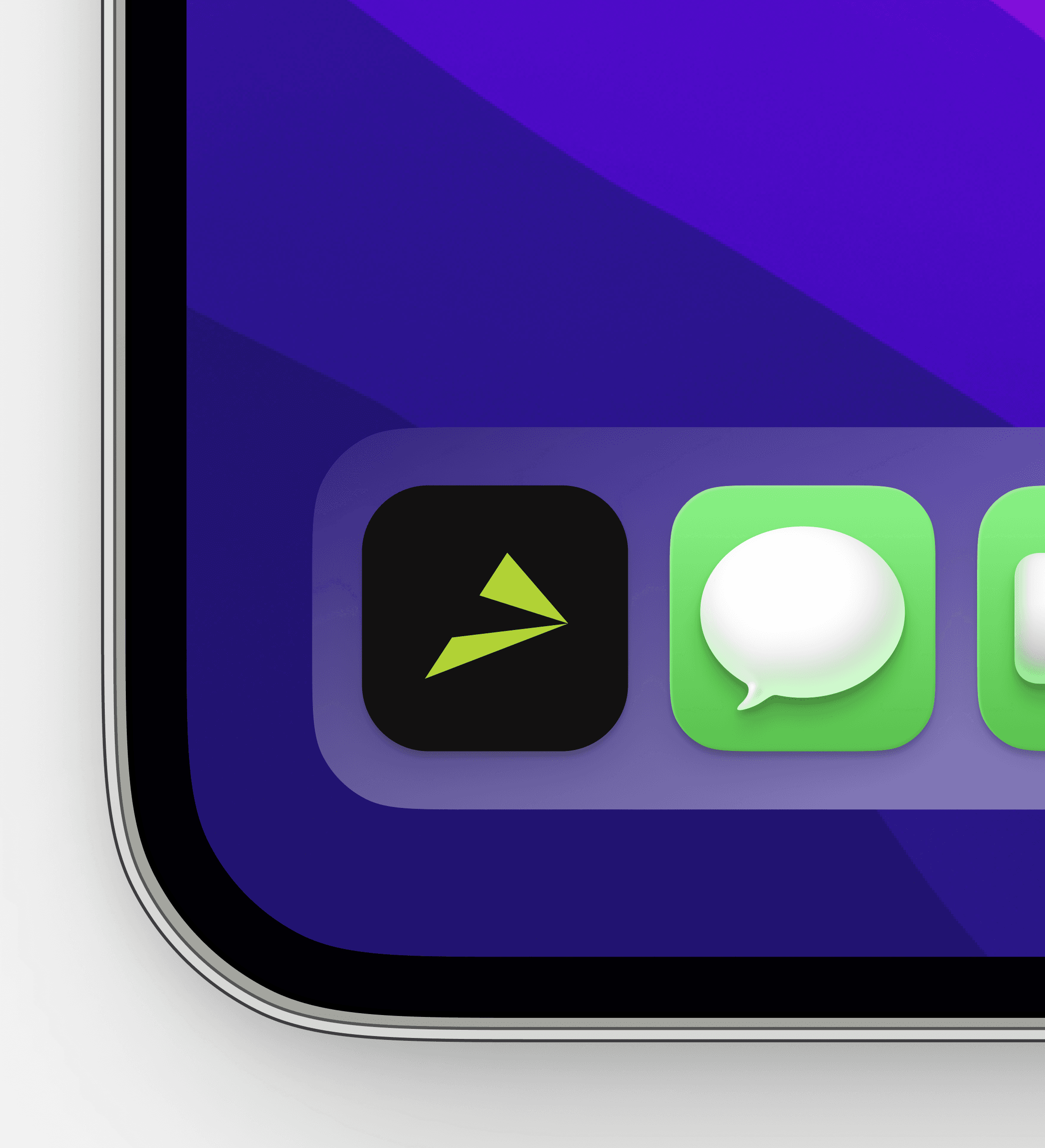
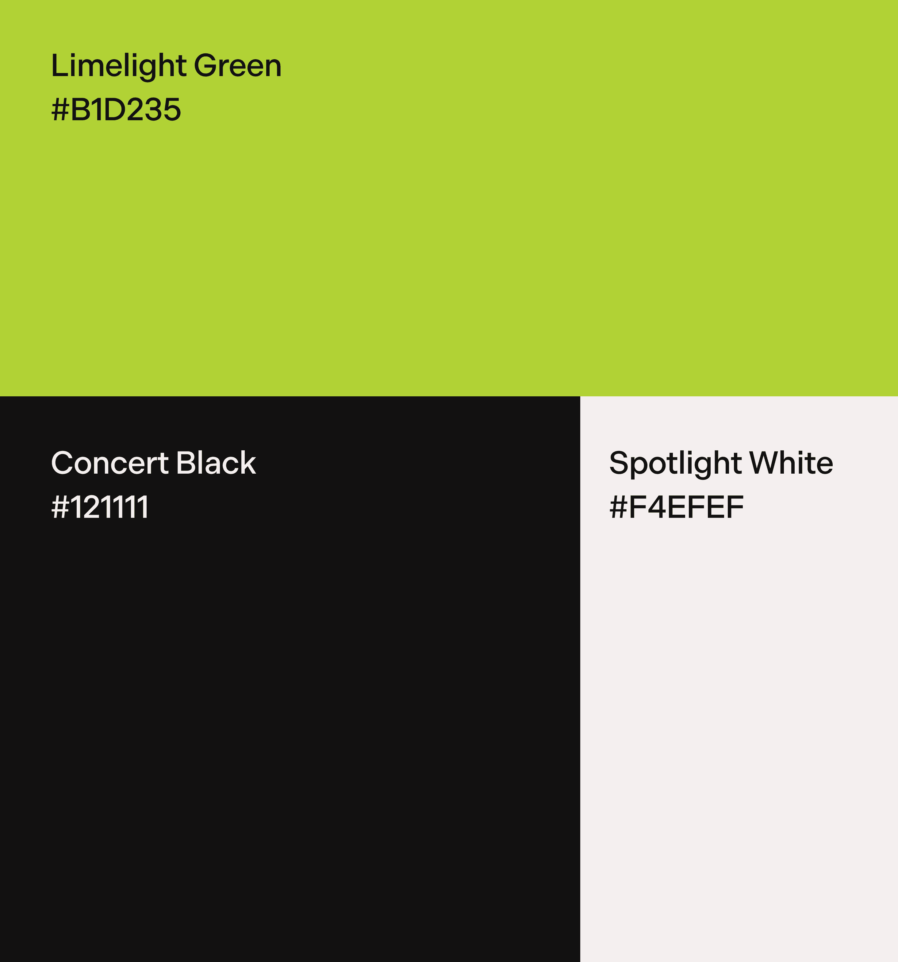
Through Concerto's brand, I wanted to create a bold and eye-catching visual identity. The logo is two triangles that represent a spotlight or concentrated beams of light you see during a concert.

What's a concerto?
A concerto is an instrumental composition that highlights a soloist, accompanied by an orchestra. The soloist plays in the front to be seen and heard clearly, but still performs in harmony with the rest of the ensemble.
Concerto aims to prioritize the customer's overall ticketing experience, rather than treating them like a source of profit.
By placing the customer under the spotlight, we can then find ways to better support them.

INTERFACE
The next phase
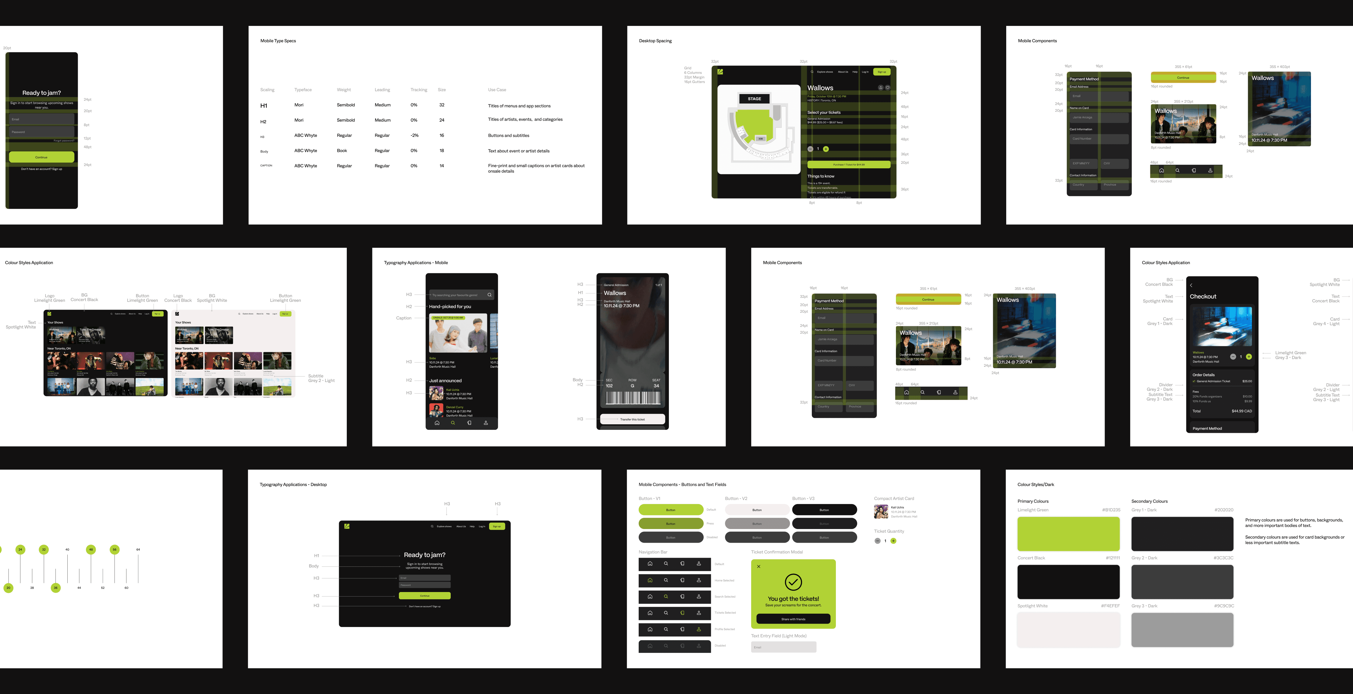
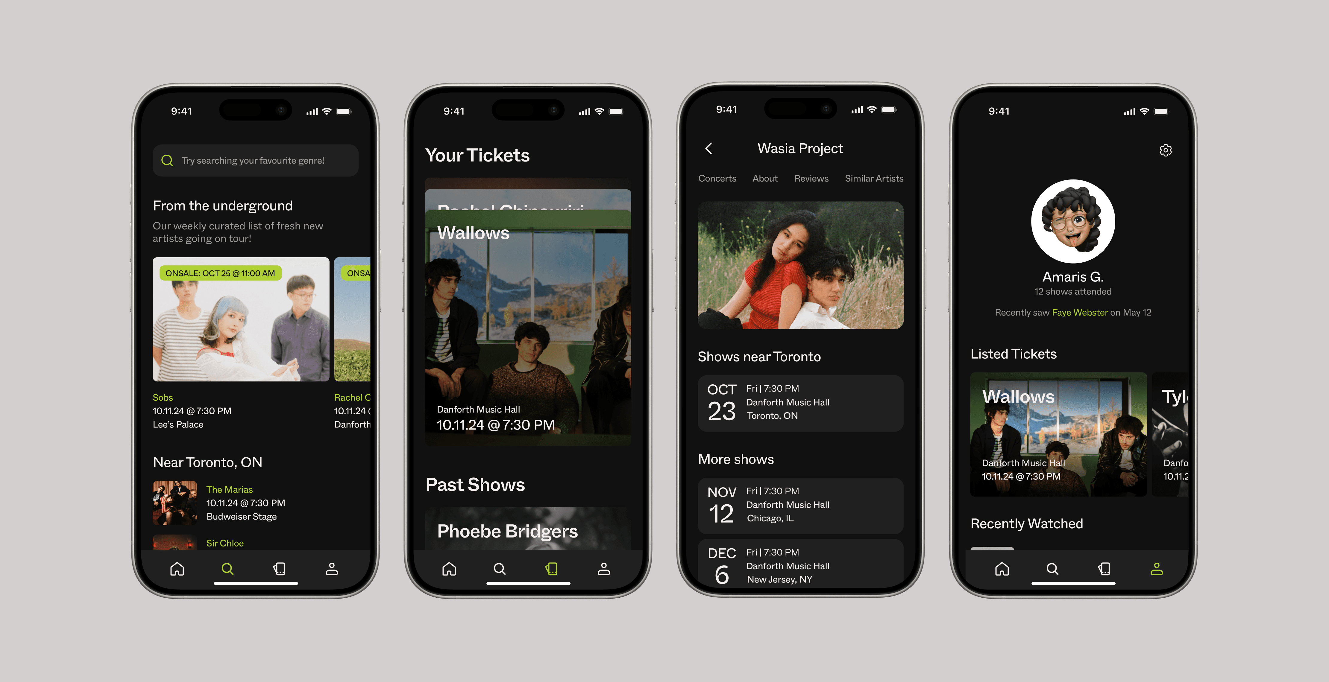
With an established brand identity, I moved on to creating the user interface for the Concerto app.
The main goal for the app was to make buying tickets simple, while presenting the customer with streamlined information.
Below is a design system I created as a guide for designers or developers that need to work on the app as well.
INTERFACE
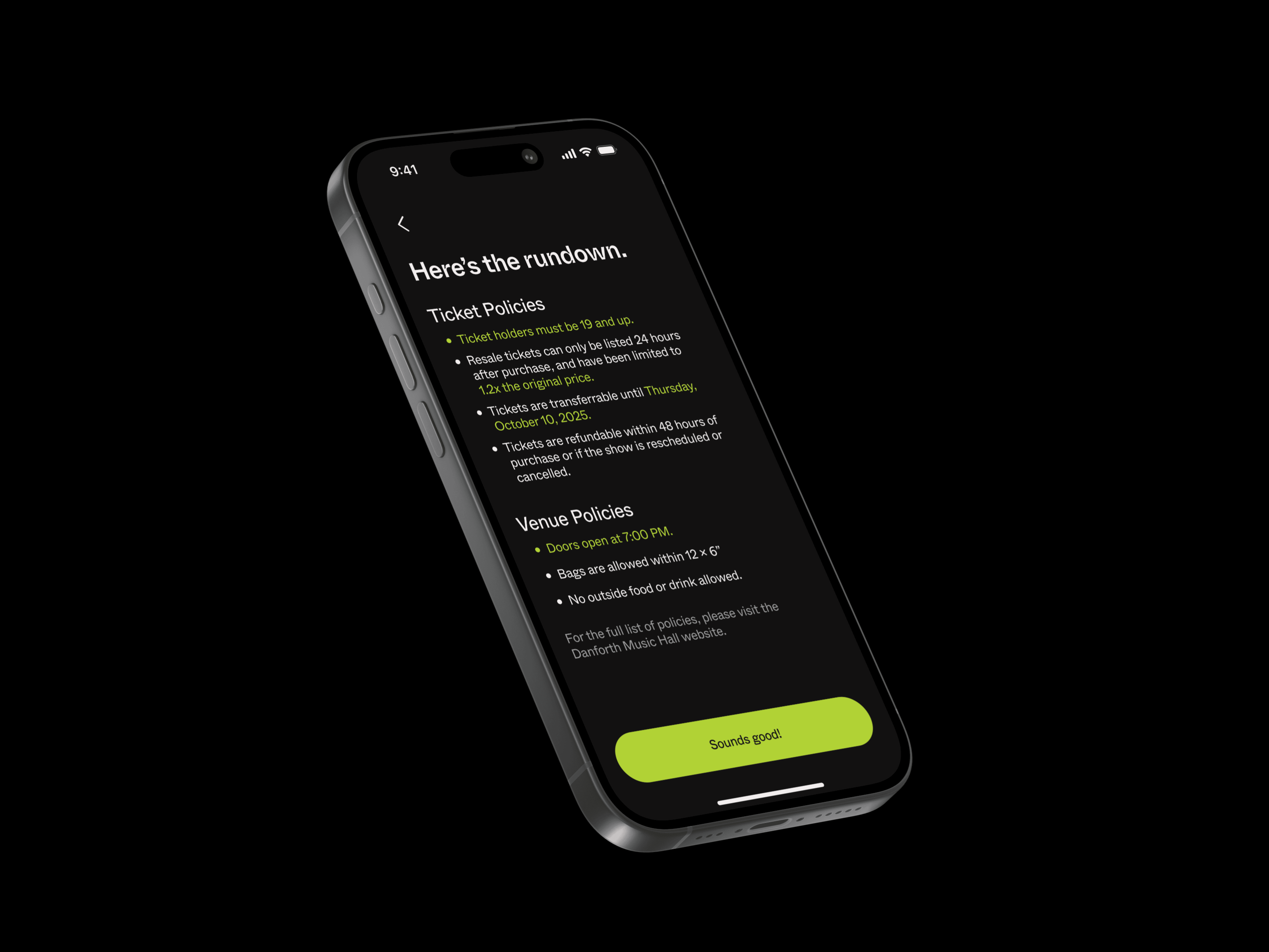
Helping fans stay in the know.
Sometimes, apps like Ticketmaster don’t always provide ticket policies and pricing before sales. Concerto ensures that the most important information regarding events is available to fans from the start.
Right before users enter the ticket purchase page, they're shown all the rules and policies for the event.


FUN FEATURES
Rewarding fans
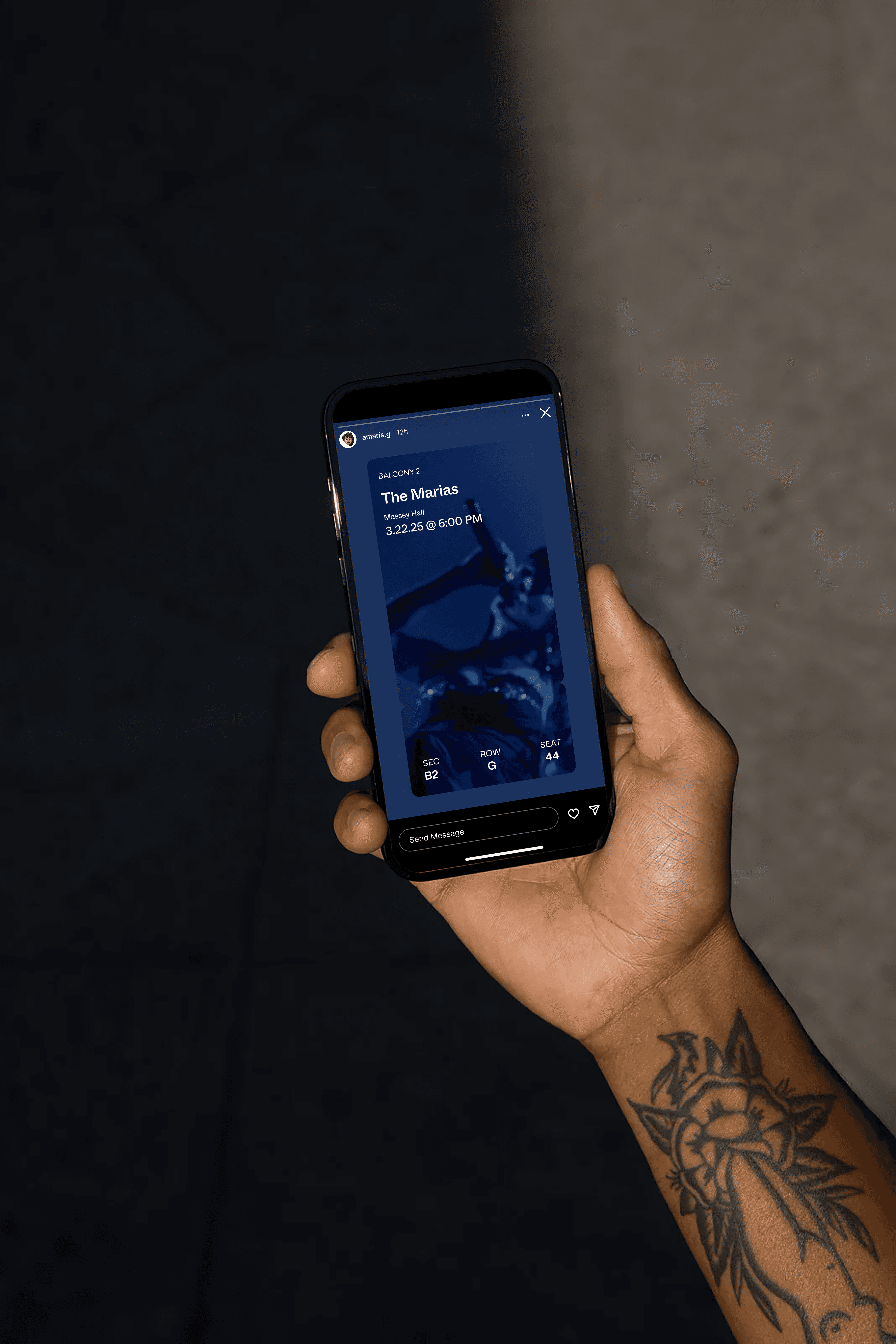
While the branding already caters to Gen Z, I wanted to add another feature that would appeal to the app's users.
When people score tickets for their favourite artists, they love to show it off on social media. So, why not turn their tickets into digital memorabilia?
The elevated design (in comparison to your average ticket) features a short artist video and key information about the event. Rather than showing a plain black and white document with all their billing information, users can safely show off their tickets to friends online.
Takeaways
Working on this project for a whole semester allowed me to understand the complex design systems and processes that goes into designing a brand and applying it to user interfaces.
Seeing my design come together from an idea into a cohesive identity was highly rewarding. I believe that if more time was given to conduct more user research and testing, this project could improve substantially.