CONTEXT
Glasses come in a wide variety of shapes and sizes, but why do some people still feel uncomfortable wearing them? The simple answer is that our faces are all unique and what may fit others may not fit us.
KitaKita is a sustainable and inclusive eyewear brand that designs frames to fit a wider variety of facial features.
This was a personal project that I worked on for about 1 month, to practice brand strategy and creating brand guidelines.
PROBLEM STATEMENT
How can I create an eye-catching visual identity for an inclusive eyewear brand?
The Solution
Introducing KitaKita, an innovative eyewear brand that aims to provide accessible and comfortable eyewear for everyone.

BRANDing
After researching different eyewear brands, I found that a lot of them used the same blue/grey neutral colour palette that didn't make their brand stand out.
I wanted to use bold colours as a way to attract customers and set them apart from the competitors.
However, I still wanted the customers to feel welcomed and included, so I used a typeface that helped give a softer and friendly image.


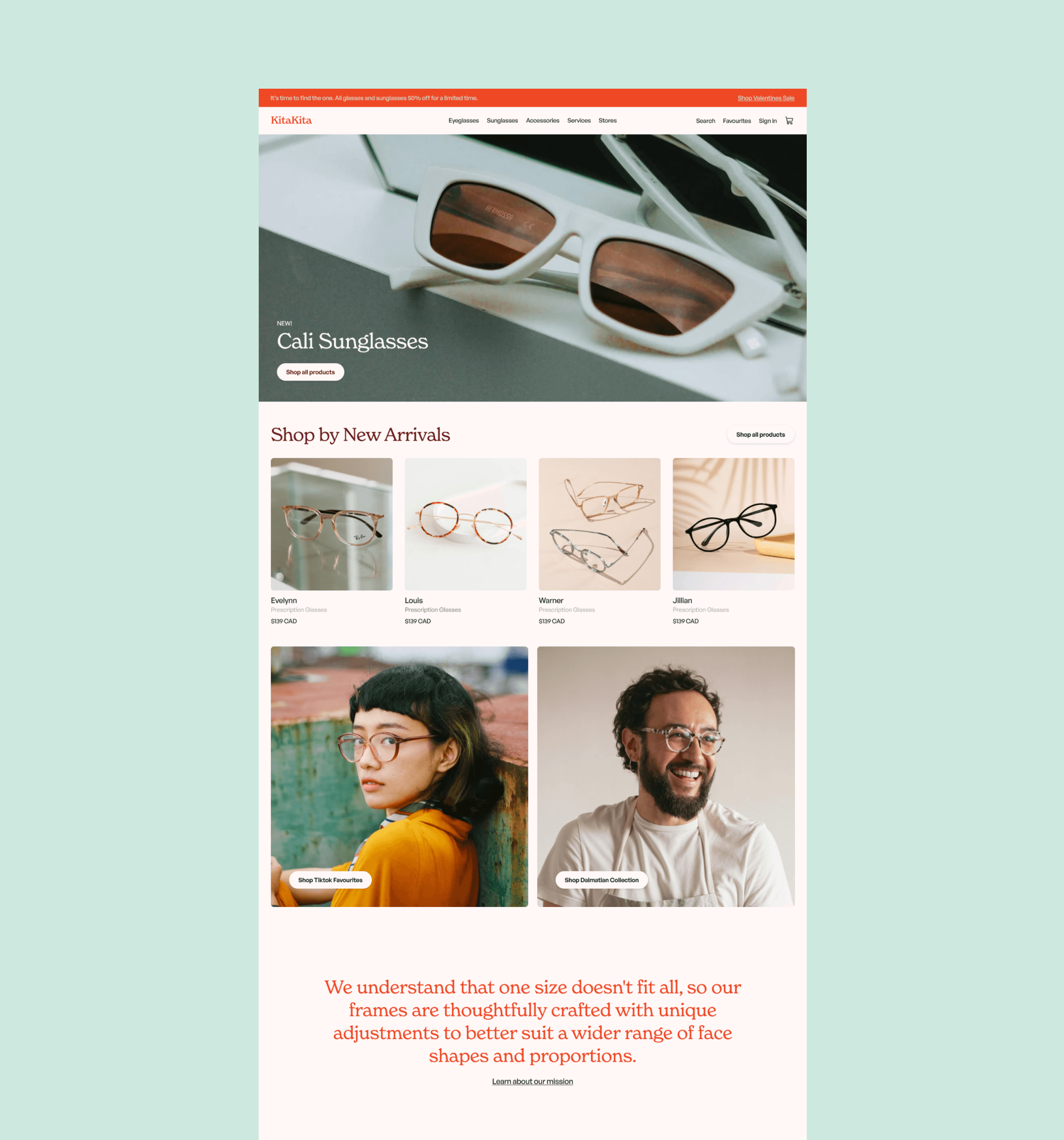
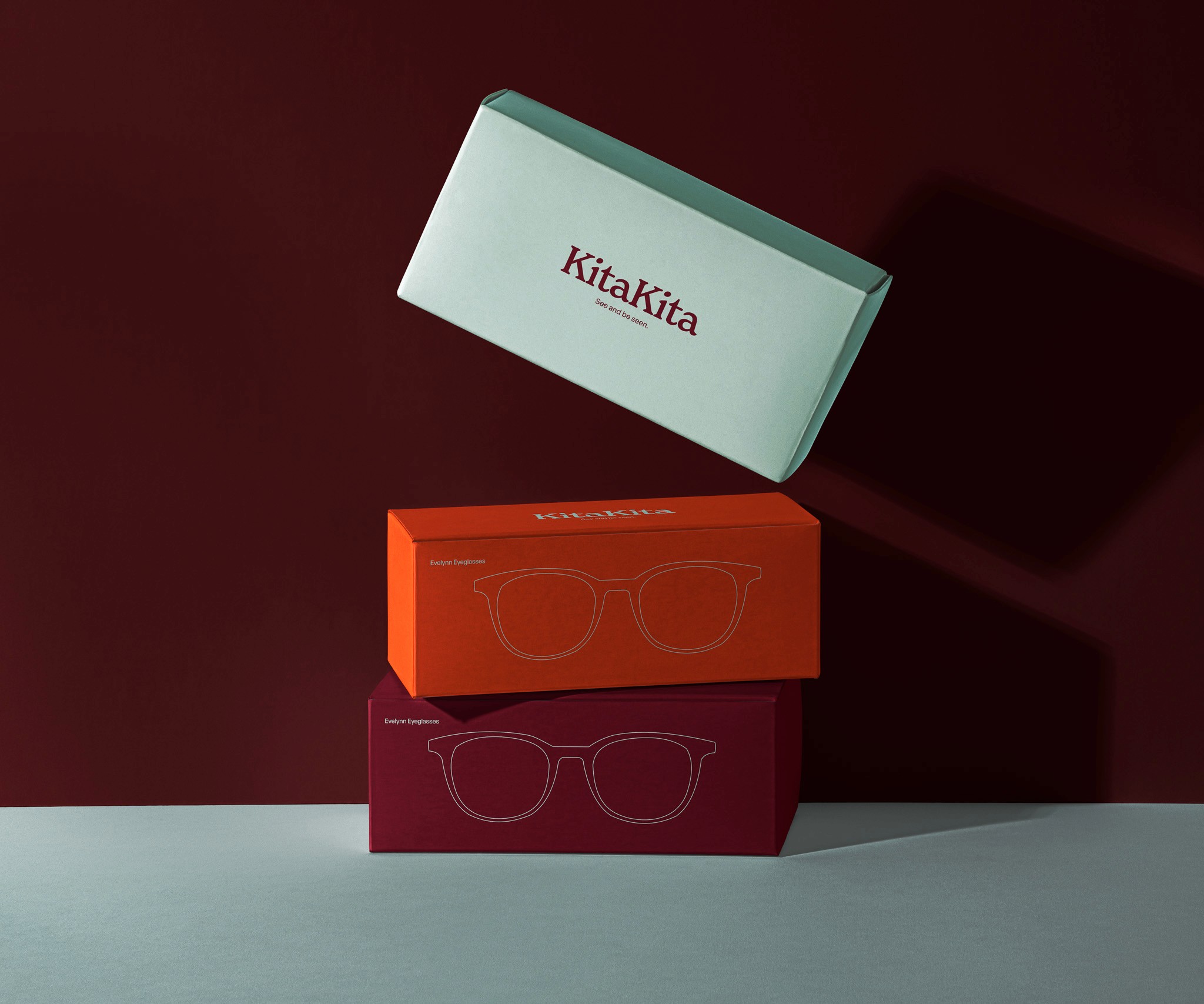
BRAND APPLICATION
Seeing it in action
After designing the brand guidelines, I moved on to create mock ups of various ways the brand could be communicated. The final deliverables include concepts for a home page for KitaKita's online store, packaging design, and business cards.

Where does KitaKita
come from?
The company's name comes from the Tagalog phrase, “Kita-kita,” which translates to “I see you.” With this in mind, we started an eyewear brand with a primary mission to create glasses that make people feel seen.

Takeaways
While I spent a short amount of time on this project, this was a great introduction to the branding process! It helped me to understand that branding is more than just colours and logos, and relies on a strategic approach that helps direct the energy, tone, and message of the brand identity.